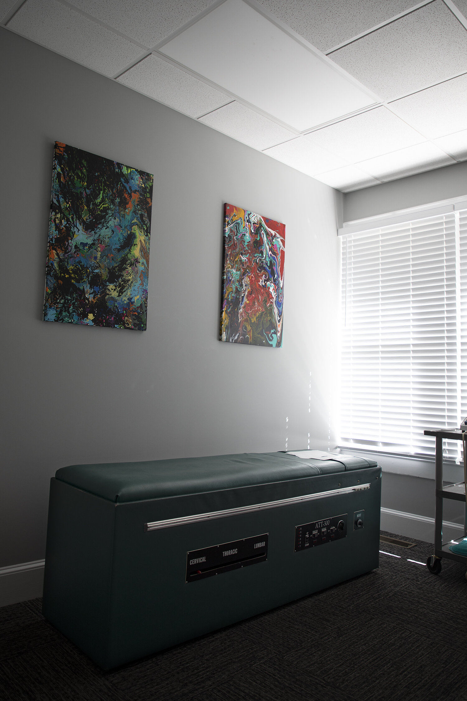
“Now, as a chiropractor’s office, the bones of the house have been realigned for its next function, ready for a revival, respectfully adding another chapter to the story of the house. ”
Built in 1921, the house at 455 West John has been a rental for many years, first as a residence and then for several salons. The home-turned-office was rezoned in January 1999 from residential to business.
The property has seen numerous owners over the years, many of whom are familiar Matthews names: In 1910, JG and Mabel Orr purchased the property, and sold it in 1919 to SR Reid. SR Reid was likely the builder of the home in 1921, and passed it to Mary Willie Reid in 1926. Willie sold it in the ‘40s to Louise and Jane Knowles, two of eight Knowles children (Their brother George Jr. was, according to our sources, the only Matthews resident killed in action in World War II, VFW Post 9475 was named for the late TSGT Knowles).
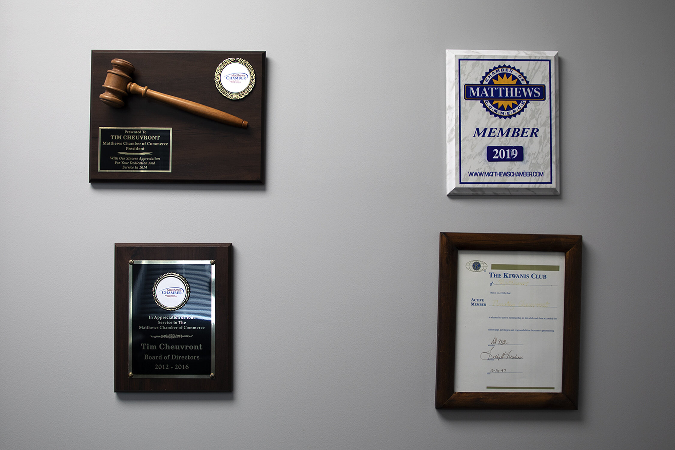
Today, the home is in the hands of Dr. Timothy Cheuvront, of Cheuvront Chiropractic, who recently moved his office to Downtown Matthews. Dr. Cheuvront has been dedicated to bringing the structure back to life with an era-appropriate approach and an eye for detail. This is a house full of charm, willing to tell its own story.
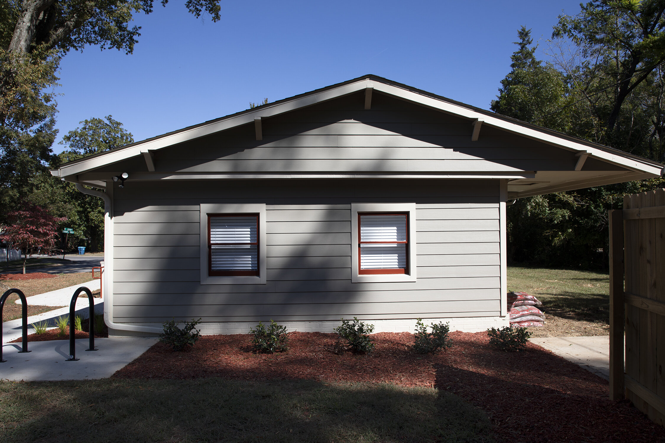
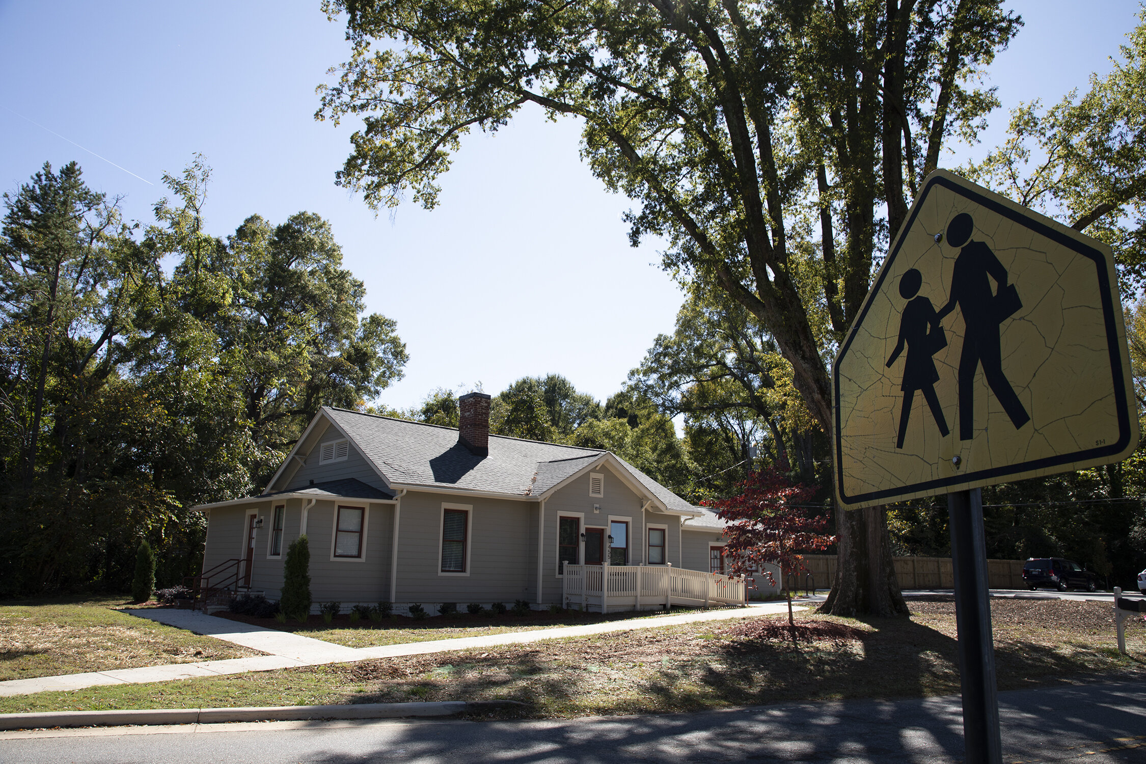
Succinctly described as a modified bungalow with Craftsman elements, the facade has the charm of a Craftsman without some of the style’s defining characteristics. As the home has passed from owner to owner over the years many changes have been made to the structure, making it ineligible for historic designation. When Dr. Cheuvront purchased it, however, he knew he wanted to maintain the historic appearance. It’s not a big space, 1,783 square feet; amply sized for the 20s when it was built. (According to census data, the size of the average single-family home built now is closer to 2,400 square feet.) A tour that takes time to appreciate all the details still takes less than half an hour.
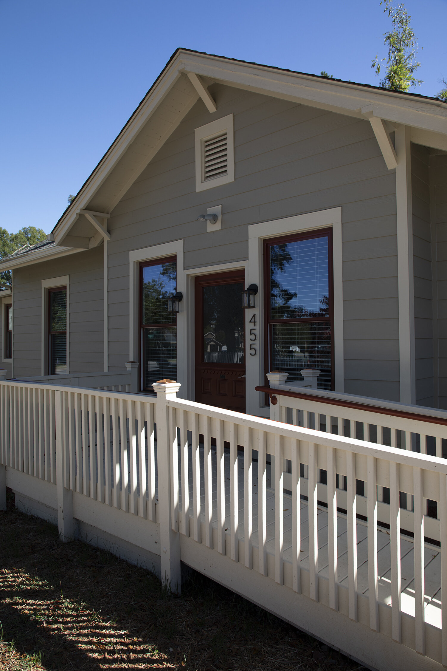
With rich, earthy tones (Monterey taupe Hardie Board with Navajo Beige trim) appropriate for the era, the design of the 1920s building is grounded, a reaction to the ornate details of the previous Victorian era. The color scheme perfectly complements Dr. Cheuvront’s personality: warm, down-to-earth, and inviting.
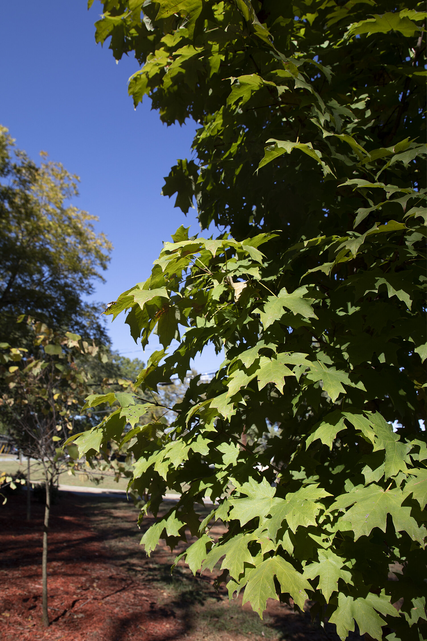
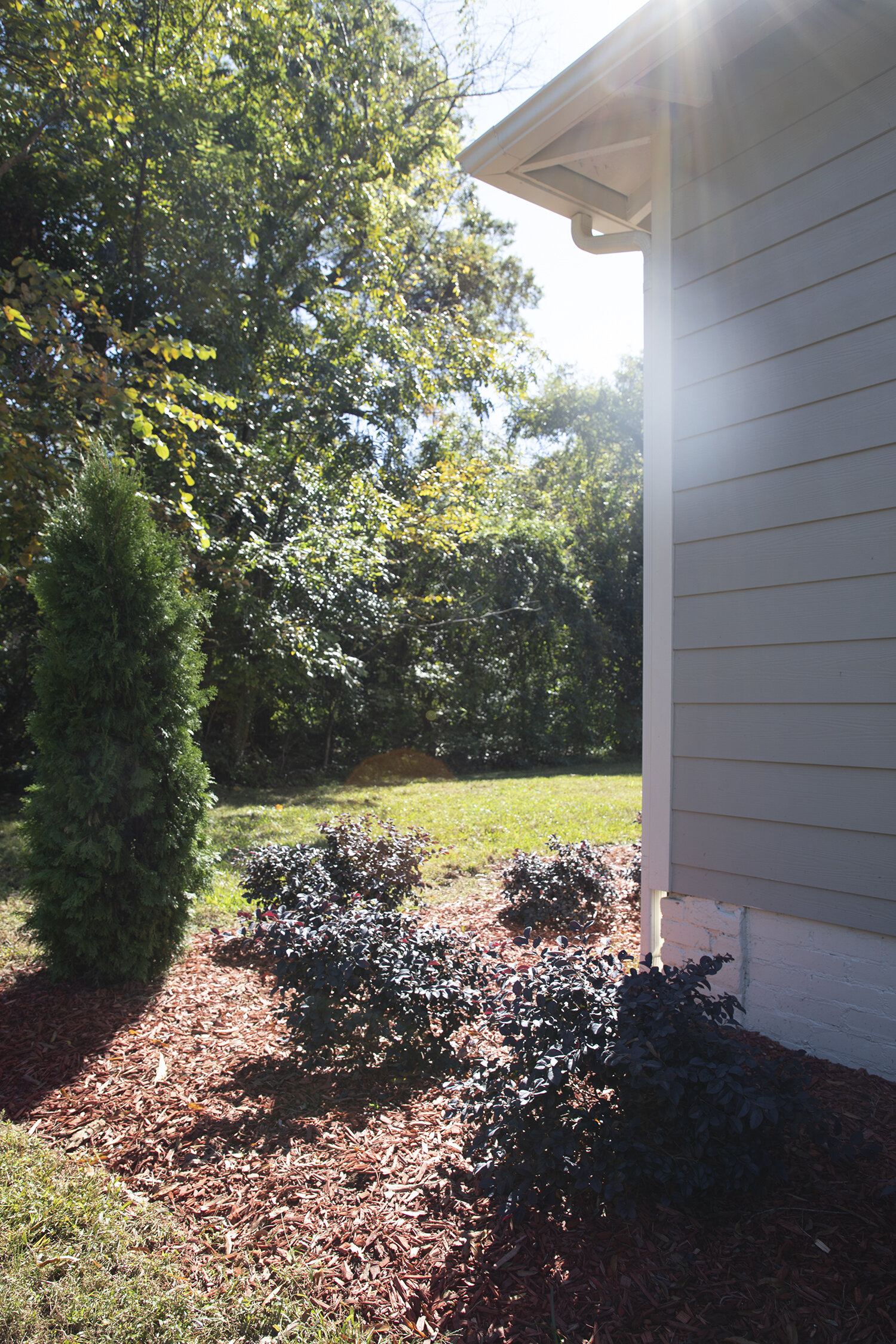
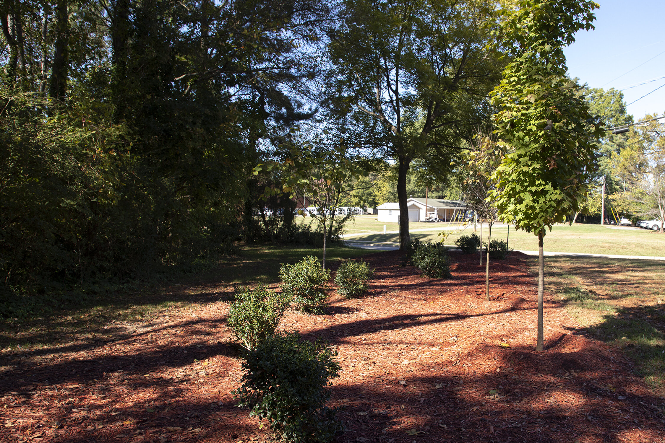
The most recent renovations have ushered the building into the 21st century, nearly 100 years after its original construction. The house has been updated for ADA compliance, including a front ramp. If the park-like landscaping doesn’t beckon pedestrians, the well-placed sidewalks will. The landscaping deliberately complements the structure. As we toured, the trees were in full autumnal glory, the foliage perfectly complementing the Roycroft Copper Red details. It all sets a relaxing pace: you’re there for self-care, not to be rushed.
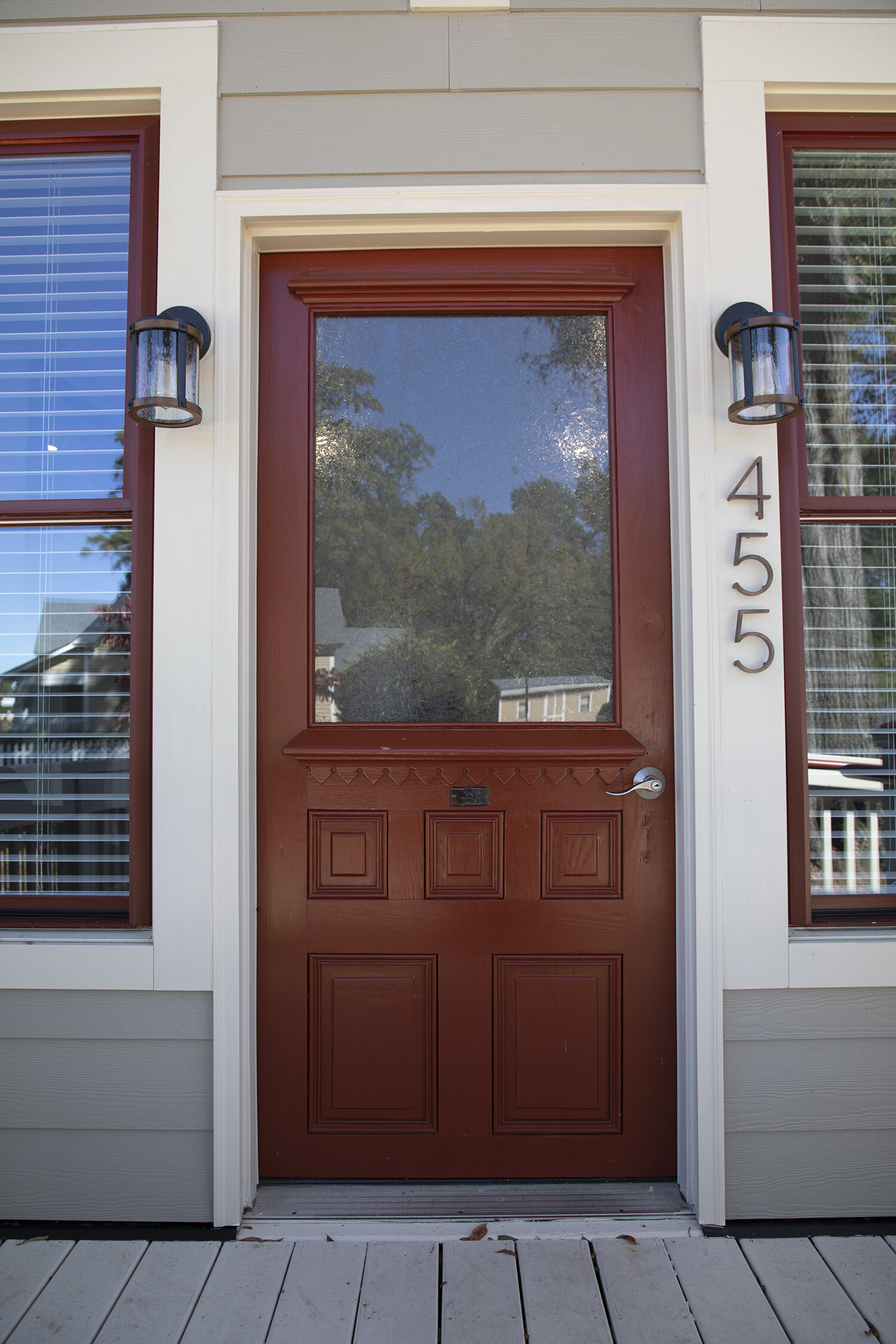
The early twentieth-century front door adds a charming first impression. With beautifully carved details too modest for Victorian, too ornate for Craftsmen, the half-glass door is a perfect reflection of the interior space: a well-loved building with utilitarian adaptations over the course of nearly a century.
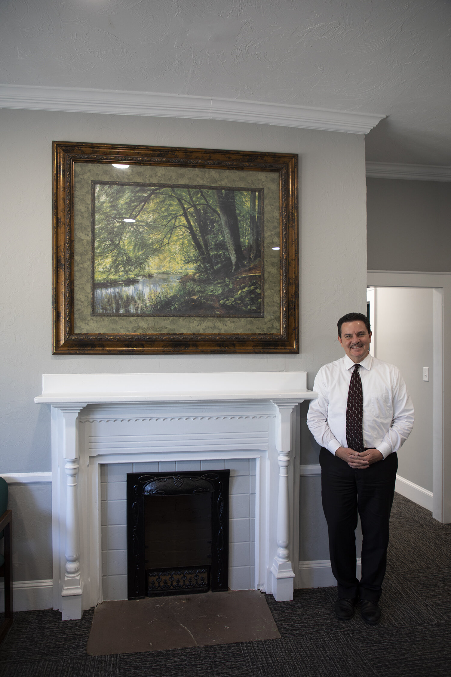
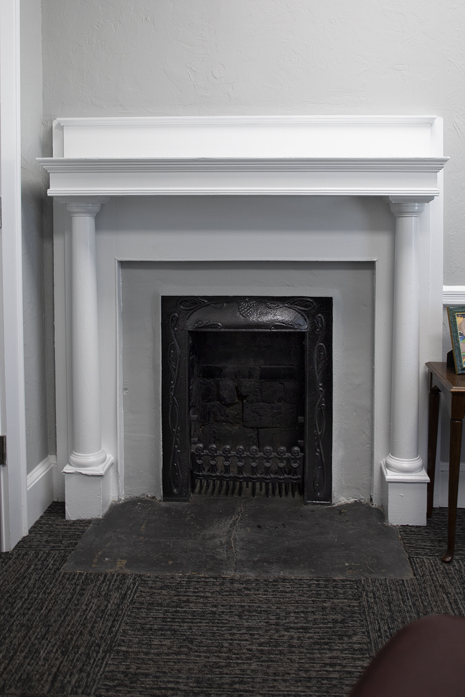
The building retains many original features. Plaster walls painted a soothing gray feel sturdy and substantial. Bright white ceilings and interior trim are highlighted by the large windows. An ethereal amount of natural light saturates the offices. As we tour, Dr. Cheuvront notes the details on each window casing, each slightly different, styles indicative of several eras and previous owners. Many rooms have their own fireplaces, reminders of the age of the house.
Modern updates, such as sliding barn doors, play on the vintage charm of the home, drawing the eye up to the beadboard ceiling above, in what was once, presumably, a porch. The layers of paint, thick on the ceiling, show many years of loving use and wear in the home. Now, as a chiropractor’s office, the bones of the house have been realigned for its next function, ready for a revival, respectfully adding another chapter to the story of the house.

